

Written by Venturz Editorial Team,
Category: Marketing and sales

When you visit a website, what's the first thing that catches your eye?
More often than not, it's the homepage design. This is no small detail, in fact, 75% of consumers judge a brand's credibility based on their website design, especially the homepage.
Yet, a considerable number of individuals Struggle with achieving accuracy, "What should my homepage look like?" or "Which elements are essential?" and "What purpose should my homepage serve?"
This is where the art of homepage design comes into play. It's about striking a balance between aesthetic appeal and practical functionality, ensuring that your website's homepage not only captures attention but also guides your site visitors effortlessly to their desired destination.
In this digital age, where first impressions are formed in an instant, getting your homepage designs right is more important than ever.
Crafting an engaging and effective homepage design is crucial for any website. It's the first thing your visitors see and can significantly impact their perception of your brand.
Here are some key elements to consider when designing your website's homepage.
The headline of your website homepage is your first chance to communicate your value proposition to your audience.
It should be clear, concise, and compelling, capturing the essence of what you offer in just a few words. This is crucial because it's often the deciding factor for a visitor to stay or leave your site.
Following the headline, the sub-headline plays a supportive role. It provides additional context, elaborating on the services or products you offer.
The sub-headline should complement the headline by offering a brief, yet informative description that deepens the visitor's understanding of what you do and how it benefits them.
Together, the headline and sub-headline form a powerful duo that can effectively capture and retain the attention of your visitors.
Primary Calls-to-Action (CTAs) are the driving force of your homepage design, guiding visitors towards key actions you want them to take.
These could range from signing up for a newsletter to scheduling a demo or making a purchase.
A well-designed CTA button is clear, eye-catching, and uses action-oriented language, making it stand out on the page. It should be placed strategically so that it's easily noticeable without disrupting the user's browsing experience.
Supporting images and visuals play a crucial role in enhancing the appeal and effectiveness of your website homepage.
High-quality headshots and relevant graphics not only grab attention but also aid in storytelling, helping to convey your brand's message and values.
These visuals should be chosen carefully to resonate with your target audience and reflect the content's theme. For instance, a dark background can make your images stand out, adding depth and emotion to your homepage design. Additionally, using a background changer can help tailor the mood of your visuals, allowing for flexibility in how your brand is presented.
The right visuals, including HD wallpapers, can transform your homepage from a simple information portal into an immersive experience.
Social proof is a powerful element in homepage design, significantly enhancing your website's credibility and trustworthiness. This can be in the form of testimonials, customer reviews, case studies, or endorsements from well-known clients or figures.
By showcasing real-life examples of customer satisfaction or success stories, you provide tangible evidence of the value and reliability of your products or services.
Including social proof on your homepage can be an excellent way to build confidence among prospective customers and encourage them to engage with your brand.
Navigation is a key component of your website homepage, acting as the roadmap for your visitors. It should be intuitive, straightforward, and organized, allowing users to find what they're looking for with ease.
For many websites, a hamburger menu is a popular choice, especially for mobile versions, as it neatly consolidates all navigation links into a single icon, saving space and reducing clutter.
Effective navigation enhances user experience, reduces bounce rates, and ensures visitors can explore your site without frustration or confusion — and understanding user experience (UX) can help you design navigation that feels intuitive from the first click.
Content offers on your homepage are a strategic way to engage visitors and provide additional value. These could include downloadable resources like ebooks, whitepapers, or industry reports.
By offering high-quality, relevant content, you not only attract potential customers but also establish your brand as a knowledgeable authority in your field.
Content offers can also serve as a lead generation tool, encouraging visitors to provide their contact information in exchange for valuable resources. This approach not only enriches the user experience but also helps in building a database of potential leads.
Secondary Calls-to-Action (CTAs) are crucial for engaging visitors who might not be ready to commit to your primary CTA. These CTAs often take a softer approach, like inviting visitors to learn more about a product or service, subscribe to a newsletter, or view a portfolio.
Placed strategically throughout the homepage, they provide alternative pathways for visitors to interact with your site, keeping them engaged and guiding them through the buyer’s journey at their own pace.
Secondary CTAs ensure that even if visitors aren't ready for a major commitment, they still have meaningful ways to stay connected with your brand.
The features and benefits section of your homepage is where you showcase what you offer and why it matters to your target audience.
This section should clearly articulate the unique aspects of your product or service and how they solve specific problems or improve the lives of your customers.
Features describe the product or service itself, while benefits explain the positive outcomes they bring.
This distinction is key in communicating value to potential customers, helping them understand not just what you sell, but why it's important for them.
Including a resources section on your homepage can significantly enhance the user experience and establish your brand's authority.
This section might contain links to blog posts, case studies, FAQs, or educational materials that provide deeper insights into your industry or offerings.
By offering a wealth of information at their fingertips, you not only educate your audience but also demonstrate your expertise and commitment to their needs.
This approach can increase the time visitors spend on your site, improve engagement, and position your brand as a go-to source for valuable information.
Success indicators such as awards, recognitions, client logos, or notable achievements add a layer of trust and credibility to your homepage. Displaying these accolades reassures visitors of your expertise and success in your field.
Whether it's industry awards, media mentions, or testimonials from high-profile clients, these indicators serve as powerful testimonials to the quality and reliability of your offerings.
Including them on your homepage can significantly boost confidence in your brand, making visitors more likely to engage with your products or services.
Creating a well-designed homepage is more than just an aesthetic endeavor; it's about crafting an experience that resonates with website visitors.
Here are some useful and specific best practices for homepage design:
A compelling value proposition is the cornerstone of an effective homepage. It's a clear statement that answers the crucial question:
"Why should a visitor care about your product or service?" This proposition should be prominently displayed on your homepage, ideally above the fold where visitors see it immediately.
It needs to be concise yet powerful, summarizing the benefits of your offering in a way that resonates with your target audience. Think about what sets your product or service apart and how it solves a problem or fulfills a need for your customers.
The key is to communicate this in a way that is both understandable and enticing, making it clear why your offering is superior to others in the market.
CTA buttons are vital in guiding your website visitors towards a desired action, such as making a purchase, signing up for a newsletter, or scheduling a consultation.
The strategic placement of these buttons on your homepage can significantly impact their effectiveness.
Ideally, your primary CTA should be placed high on the page, visible without scrolling (above the fold). It should stand out with a contrasting color or design that draws attention.
Additionally, consider the journey of your visitors – where are they most likely to be convinced to take action? Placing CTAs at these strategic points can increase the likelihood of engagement.
Remember, the goal is to make it as easy and intuitive as possible for visitors to navigate to the next step in their journey on your site.
Incorporating a search bar in your homepage design is a practical way to enhance user experience, especially for content-rich websites.
It allows visitors to quickly find specific information, products, or services, saving them time and frustration.
It should be easily visible and accessible, ideally placed near the top of the page. It's important to ensure that the search functionality is efficient and delivers relevant results.
This feature is particularly beneficial for e-commerce sites or businesses with extensive blogs or resource libraries.
By providing a seamless search experience, you encourage visitors to engage more deeply with your content, increasing the chances of conversion or further interaction with your brand.
Customer testimonials and logos of clients or partners are powerful tools for building trust and credibility on your homepage.
Testimonials provide social proof, showcasing real-life examples of customer satisfaction and the effectiveness of your products or services.
Choose testimonials that are specific and relate to key benefits of your offering. Logos, especially of well-known clients or partners, also add a level of prestige and reliability.
Display these elements in a prominent section of your homepage, where they are easily seen by visitors.
This not only enhances the perceived value of your offerings but also instills confidence in potential customers, making them more likely to engage with your brand.
Optimizing your website for visitors' experience is crucial in retaining their interest and encouraging engagement.
This involves ensuring your site loads quickly, is easy to navigate, and is responsive across all devices, especially mobiles.
Pay attention to the layout; it should be intuitive and guide the visitor naturally through your content. Use clear, readable fonts and ensure there's a balance between text and visuals to avoid overwhelming your audience.
Accessibility is also key; your site should be usable by everyone, including those with disabilities. Regularly test different browsers and devices to ensure a consistent experience, cross browser testing ensures that your website or web application works seamlessly across all browsers.
To ensure the best user experience, you can take advantage of professional services and convert a custom design that meets all your needs from PSD to responsive HTML pages.
Remember, a positive user experience on your homepage sets the tone for how visitors perceive the rest of your site.
Showcasing the best homepage examples, especially those within your industry, can provide visitors with a clear understanding of your expertise and design capabilities. This is particularly effective for web design agencies or freelancers.
Include a portfolio section on your homepage where you highlight your best work. Use high-quality images or interactive previews to showcase these examples.
Explain briefly what makes each design effective – whether it’s the innovative use of space, the engaging interactive elements, or the seamless user experience.
This not only demonstrates your skills and creativity but also serves as inspiration for potential clients looking for homepage design ideas or browsing a design concept list. It’s a way to not just tell but show visitors what you can achieve, adding depth and credibility to your offerings.
A simple homepage design can be incredibly effective. It focuses on delivering a clear message without unnecessary distractions. To achieve this, use a clean layout with plenty of white space.
This approach helps in drawing attention to the most important elements, like your call to action buttons and key messaging. Implementing focal point design ensures that users' eyes are naturally guided toward essential content, making the experience more engaging and intuitive.
Avoid cluttering the page with too many images, texts, or colors. The navigation should be straightforward, helping visitors find what they need without confusion.
A simple design doesn't mean boring; it's about being purposeful with each element you include.
This kind of design not only looks professional but also improves the site's loading time and usability, making for a better overall user experience.
Highlighting key features on your homepage is essential to convey the value of your product or service quickly and effectively.
This could include a brief overview of your services, unique selling points, or specific benefits your customers can expect.
Use engaging visuals and concise text to make these features stand out. It's also beneficial to incorporate interactive elements or short animations to draw attention to these points.
Ensure that these features are easily identifiable and provide enough information to pique the interest of your visitors.
By clearly showcasing what you offer and how it benefits the user, you can easily communicate your value proposition and encourage visitors to explore further.
The first impression your homepage makes is crucial and often determines whether a visitor stays or leaves. To ensure a positive impact, focus on creating a strong visual hierarchy.
This means organizing content in a way that guides the visitor's eye through the most essential elements in order of significance.
Use contrasting colors to highlight key areas like your call to action or important financial information, if relevant. The overall aesthetic should align with your brand identity, conveying professionalism and trustworthiness.
Remember, doing an excellent job with your homepage design isn't just about looking good; it's about creating an intuitive and welcoming experience that resonates with your visitors.
For more inspiration, look at design examples from successful websites in your industry.
Incorporating interactive elements into your homepage can significantly enhance user engagement.
These elements, such as hover effects, animated graphics, or interactive infographics, can make the exploration of your site more enjoyable and memorable.
However, it's important to use these features judiciously. They should add value to the user experience, not detract from it. The key is to maintain a balance , the interactive elements should complement the site's design and content, not overwhelm it.
When done right, these features can do an excellent job of capturing and retaining the visitor's attention, making your homepage not just informative but also engaging.
Remember, while adding interactivity is not always an easy task, it can significantly elevate the overall appeal of your homepage.

Foursixty showcases a masterclass in homepage design, blending simplicity with powerful messaging.
It's tailored to immediately resonate with its target audience in the eCommerce sector.
Key highlights of this design include:
- Simplified Messaging: “Your UGC. Your Instagram. Made shoppable.” This concise statement effectively communicates the platform's focus on shoppable Instagram content.
- Clear Call to Action: Offers a 21-day free trial, prominently guiding visitors to engage.
- Social Proof: Boasts credibility with "Trusted by over 3000 brands," enhancing trust among eCommerce stakeholders.
- Targeted Design: Tailored to appeal to its eCommerce audience, combining modern design with functional clarity.
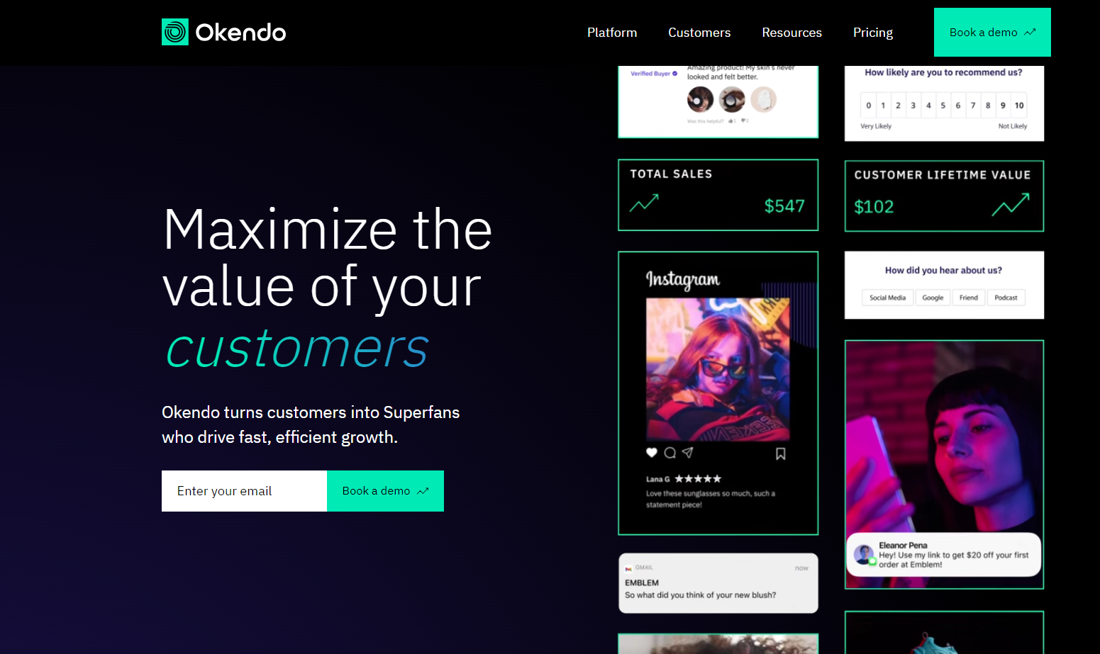
Okendo's homepage design is a prime example of how to effectively communicate a brand's core service to its visitors.
The design is both engaging and informative.
key aspects of which include:
- Bold Heading: "Customer Reviews" immediately informs visitors about the platform's focus, making it clear and direct.
- Visual Emphasis: The header visual reinforces Okendo's role in the customer review space, creating a strong first impression.
- Credibility through Association: The mention of their Shopify partnership adds a layer of trust and reliability.
- Strategic Call to Action: The "Book a Demo" CTA is well-placed, serving as an effective lead capture tool.

The 500px homepage is a vibrant showcase of the brand's identity, perfectly tailored to its photography-centric audience.
Its elements work together to create a compelling and unique user experience:
- Vibrant Visual Identity: Utilizes bright colors and strong language, capturing the essence of the brand and its focus on photography.
- Relevant Imagery: Features a striking photo in the header, immediately connecting with photography enthusiasts.
- Highlighted User Benefits: Clearly lists the benefits for users, emphasizing what sets 500px apart in the photography community.
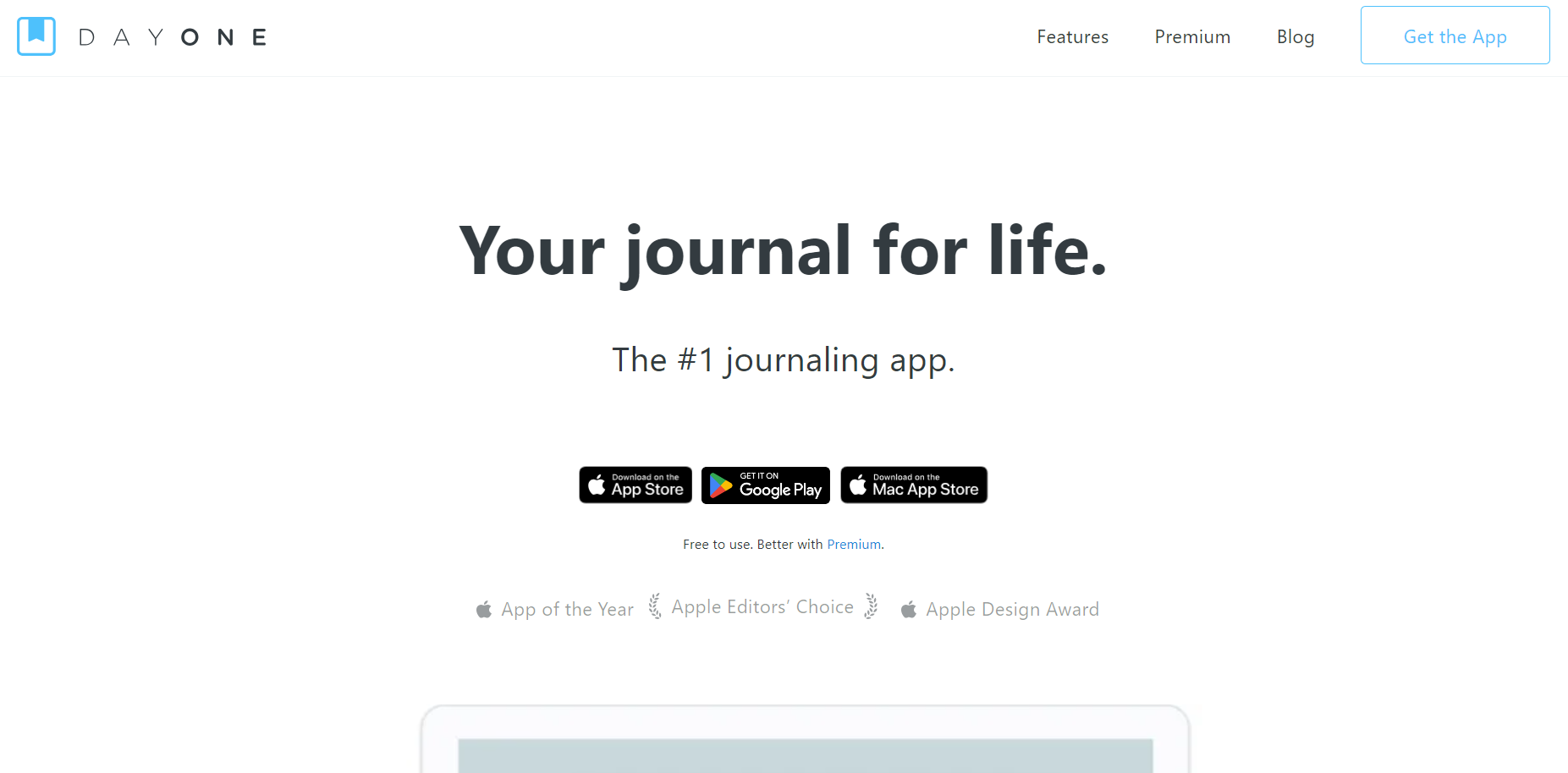
Day One's homepage is a standout example of clarity and effectiveness in web design, particularly in how it communicates its offerings to visitors.
Key aspects of this design include:
- Immediate Clarity: Utilizes the inverted pyramid model, starting with an attention-grabbing headline and a concise statement to clearly convey its offerings.
- Engaging Headline: The headline is crafted to capture immediate attention, setting the tone for the visitor's experience.
- Prominent Call to Action: Features highly visible call-to-action buttons, strategically placed to guide users towards taking the next step.
Grammarly's homepage is a testament to effective communication and user engagement in web design.
It skillfully addresses user needs and showcases the brand's strengths:
- Powerful Heading: Directly addresses common pain points, clearly illustrating how Grammarly provides solutions.
- Social Proof: Displays high customer ratings and a large user base, building trust and credibility.
- Engaging Animations: Uses animations to demonstrate the app in action, making the homepage both informative and visually appealing.
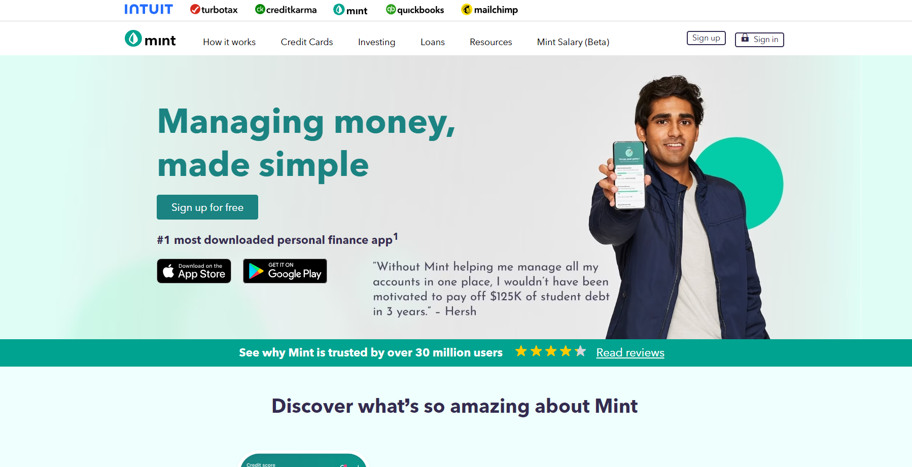
Mint's homepage design is a masterful blend of emotional appeal and practicality, especially effective for a finance-related platform.
Its design Component are thoughtfully chosen to engage and convert visitors:
- Emotionally-Charged Copy: The use of emotionally resonant language effectively appeals to visitors, highlighting the relevance and benefits of the financial service.
- User-Friendly Interface Preview: A snapshot of the app's interface in the header showcases its ease of use and intuitive design.
- Prominent Call to Action: The “Sign up Free” CTA, highlighted in orange, is strategically placed, encouraging immediate user engagement and sign-up.

Pocket Casts' homepage is a prime example of a design that's both user-centric and goal-oriented, particularly effective for app promotion.
Its design elements are strategically implemented to guide user actions:
- Direct Navigation to App Store: The homepage is designed to swiftly guide visitors towards the app store, facilitating quick and easy access to the app.
- Prominent Calls-to-Action: Features bold and noticeable call-to-action buttons above the fold, ensuring they are immediately visible to visitors.
- App Feature Highlights: Utilizes screenshots of the app effectively, showcasing key features and adhering to visual hierarchy best practices, making it easy for visitors to understand the app's functionality at a glance.
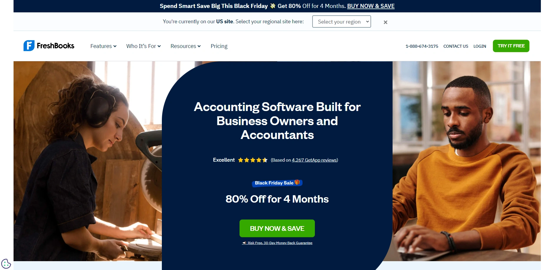
The FreshBooks homepage is a stellar example of how to effectively communicate a company's mission and features to its audience.
It combines clarity with strategic design component to engage visitors:
- Clear Communication: Directly conveys the company's mission and key features, making it easy for visitors to grasp what FreshBooks offers.
- Social Proof: Employs customer testimonials and star ratings, adding credibility and trust.
- Strategic Calls-to-Action: Primary calls-to-action are compelling and well-placed, encouraging visitor interaction.
- Color Scheme: Utilizes a thoughtful color combination that not only attracts attention but also creates a visually cohesive and appealing experience.
A24 Films' homepage demonstrates how simplicity and a focused approach can create an engaging and visually appealing web presence:
- Simplicity and Focus: The design is dedicated to showcasing trailers for new films, offering a direct and immersive experience for visitors.
- Uncluttered Layout: Each homepage item occupies a full row, ensuring a clean and streamlined appearance.
- Ease of Navigation: This layout contributes to easy navigation, allowing users to smoothly browse through content.
- Color Scheme: The color palette used is minimalistic yet effective, complementing the visual content and enhancing the overall aesthetic appeal of the site.

Omsom's homepage stands as a prime example of how to captivate and communicate effectively with an audience through web design:
- Clear Value Proposition: The headline “Real Asian flavors in minutes” succinctly communicates the brand's offering, capturing visitor interest immediately.
- Engaging Hero Section: Includes reviews and a free shipping offer, paired with an enticing image, which collectively motivate visitors to explore further.
- Action-Oriented Design: The overall design encourages visitor engagement and action, facilitated by the strategic placement of elements in the hero section.
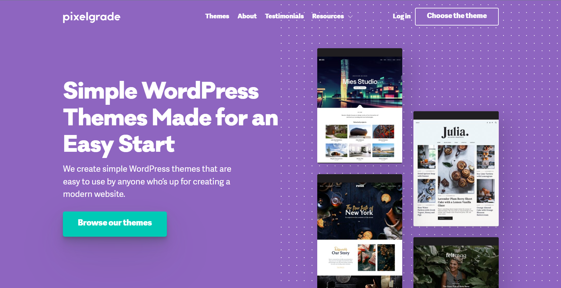
Pixelgrade's homepage is a testament to the power of clean, straightforward design in effectively conveying a brand's offerings:
- Simple and Appealing Design: The homepage's simplicity enhances its visual appeal, making it immediately clear that they offer WordPress themes.
- Incorporation of Social Proof: Includes users testimonials, adding credibility and trust to the brand.
- Effective Call-to-Action: The call-to-action is enhanced by a thoughtful color combination, making it stand out and prompting visitor engagement.

Evernote's homepage design effectively encapsulates the brand's essence, offering a clear and concise overview of its features.
Here's why it stands out:
- Clarity and Transparency: The homepage includes app screenshots, giving visitors a real glimpse of what to expect. This transparency builds trust.
- Clean and Focused Design: Utilizing a clean white background with green accents, the design is both eye-catching and uncluttered, ensuring that the main message is not lost.
- Engaging Call to Action: The prominent green 'Sign Up' button is strategically placed, making it easy for visitors to take the next step.
Spotify's homepage is a vibrant representation of its brand, characterized by its dynamic and creative approach. Key highlights include:
- Creative and Lively: The use of bright colors, shadow effects, and animations mirrors the energy and creativity of the brand, appealing to its target audience.
- User-Friendly Layout: Despite the vibrant design, the homepage remains easy to navigate. The use of white spaces between colorful sections ensures information is digestible.
- Engaging Visual Experience: The changing visuals keep the user engaged, making the homepage not just informative but also an enjoyable experience.

Zendesk's homepage stands as a model of clarity and functionality in web design, effectively conveying its unique selling proposition. Here's what makes it effective:
- Straightforward Design: The homepage is designed for ease of use, with a neat and catchy menu bar that simplifies navigation.
- Clear and Specific CTAs: Calls-to-action are well-defined and specific, guiding visitors clearly on what steps to take next.
- Clear USP Communication: Zendesk's position as a champion of customer service is prominently stated, making it easy for visitors to understand the brand's core value.

Swab the World's homepage is a vibrant and engaging example of creative web design, capturing attention with its unique style:
- Unique and Dynamic: The homepage stands out with its constantly changing bright colors, creating a visually stimulating experience.
- Elegantly Arranged Segments: Different sections of the homepage are arranged in an elegant manner, making the information accessible and easy to digest.
- Strategic CTA Placement: Calls-to-action are repeated strategically throughout the homepage, encouraging visitor engagement and action at multiple points.

Gleamin's homepage is a testament to the power of visual appeal and clarity in web design, effectively catering to its target audience.
Here's why it's effective:
- High-Quality Visuals: The use of high-quality photos immediately grabs attention, resonating with the target audience and highlighting the brand's focus on quality, such as through products like Canvas Prints for Wall Art, which add a personalized touch to any space.
- Simplicity in Navigation: A simple menu bar enhances user experience, making navigation straightforward and hassle-free.
- Clear Call to Action: The clear CTA button is strategically placed, encouraging visitors to engage with the brand.
- Concise and Clear Copy: The homepage copy is concise yet informative, providing just enough information to pique interest without overwhelming visitors.
- Well-Organized Layout: The inclusion of white spaces and well-sectioned categories ensures the homepage is not only visually appealing but also easy to navigate, enhancing the overall user experience.

Chipotle's homepage is a delicious example of how to effectively showcase a brand's offerings while engaging the visitor:
- Showcasing Services and Offerings: The homepage highlights the latest menu additions, online ordering, gift cards, and catering services, addressing various customer needs.
- Visual Appeal: Detailed and beautiful food photography dominates the site, making it visually appealing and engaging, an excellent example of how to attract site visitors.
- Engaging Design: The overall design and layout of the homepage adhere to modern design conventions, making it an awesome homepage that introduces visitors to Chipotle's vibrant world.
The 4 Rivers Smokehouse website serves as a heartwarming example of a homepage that connects with its audience:
- Engaging Photography and Headline: The use of fantastic photography and a compelling headline sells the experience, drawing visitors in.
- Brand Storytelling: The homepage design takes visitors on a tour of the services, menu, and showcases people enjoying their time, effectively sharing the brand's focus on family and community.
- Community Focus: This approach not only showcases the restaurant's offerings but also aligns with the common elements many homepages share, focusing on creating a connection with the visitor.
eWedding's homepage is a beautifully crafted portal that resonates perfectly with its target audience – couples planning their wedding:
- Tailored for the Target Audience: The design and content are specifically tailored for couples in the wedding planning phase, making it an excellent example of a focused homepage design.
- Engaging Visuals and Headline: The homepage boasts excellent product visuals and an engaging headline, capturing the essence of the service and drawing in visitors.
- User-Friendly Call to Action: The "Start now" call-to-action button is designed to reduce friction, encouraging immediate engagement from site visitors.
- Practical Tools for Users: The inclusion of a cost calculator adds practical value, making the site not just informative but also a useful tool for its users, showcasing essential elements of effective homepage design.
Homepages really matter. They're like your website's hello to the world. A good one makes visitors feel welcome and shows them around. It's not just about looking good, it's about being clear and helpful.
Your homepage is where people decide if they like your site or not. So, keep it friendly, easy to use, and true to what you're all about. That's how you make a homepage that not only looks great but also helps your visitors find what they need.
And remember, a great homepage is always evolving. It's about keeping up with what your visitors need and tweaking things to make their experience better. Think of it as a living part of your website that grows and changes with your audience.
The more you tune into what works for them, the more your homepage will work for you. It's all about creating that perfect welcome mat that invites people in and makes them want to stay.

ABOUT THE AUTHOR
Venturz Editorial Team
The Venturz Editorial Team is a group of experienced creators, product specialists, and business strategists dedicated to empowering entrepreneurs. We publish clear, actionable insights on business setup, growth, marketing, automation, and productivity — helping founders make confident, informed decisions as they build and scale their ventures.
or
Startup Events
Live Chat